We’re becoming and increasingly data driven culture. Whether it is my children’s school, my bank, the last hotel stay, a car service, a visit to the doctor’s office — everyone thinks and believes (rightly so) that they need to collect data on customer satisfaction. And now we have the tools to be able to do this easily.
Medallia is a relatively recently minted Unicorn in this space. For the longest time I didn’t know what the company did and just knew them from their presence on the first floor of the AOL building. I only realized what the company does when after a recent hotel stay I received a long and involved survey request — powered by Medallia.
SurveyMonkey is probably the most common name that comes up in this area. It’s become synonymous with surveys due to it’s eponymous and fun name. It’s also another unicorn having raised over $250M at a valuation of $2B according to press articles.
At the same time companies which allow other companies to instrument and collect data are also doing well. The big difference however is where/how the data collection happens. Automated data collection is awesome. It typically happens behind the scene, without any user intervention required. However, it comes with the risk of collecting too much data and sometimes data that is tied to an individual’s identity thereby creating privacy and ethics concerns. Automated data collection however, fails to capture one thing and that is user sentiment. It’s hard to gather how someone feels about your product them telling you about it. This means that asking users for feedback is critical.
Survey design is an art and a science. In psychology and in HCI we were taught how to carefully construct questions to ask the same question in a positive way, and a negative way and to also insert in some additional questions to try and level set for the user and try to provide some way of normalizing data across users. These surveys are intentionally designed to extract specific data from users in user studies.
However, in the case of most surveys today, I think we may have gone too far and tried to put too much of the onus of entering data on the user. It’s no wonder that survey response rates are generally pretty low and most users ignore the survey request.
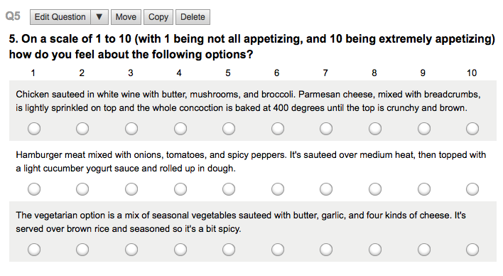
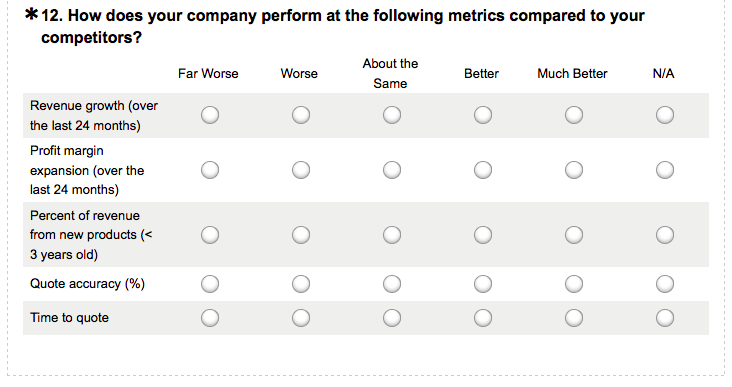
Just in the past week, I’ve probably received four or five requests for filling out a survey, where each survey takes between 7-8 minutes on the low end and as much as 15-20 minutes on the high end. Without fail, these surveys include the usual assortment of questions asking you to rate every single facet on a scale of 1-5 or 1-7. The survey itself begins to look like a digital imitation of a Scantron sheet.
I didn’t want to take pictures of the actual surveys I’ve received (to protect the guilty!) but here are just some images showing what they could very well look like:
Really? Is this what we really want to subject users to? I think we don’t need a survey to tell what the users reaction to the survey itself is. THIS SUCKS. It’s terrible. And it’s ridiculous for companies to expect consumers to respond to shit like this. We’re not here to help classify all your data so you can in one click get pretty pictures and graphs for the questions you’re trying to answer about your product or service delivery.
I used to try and respond to surveys because I felt that people deserve feedback. I guess the academic in me feels strongly that if you don’t take the time to give feedback, then you can’t expect things to improve. But I think I’m quite done with ridiculously designed surveys truly designed by monkeys (pun fully intended).
If you really want people to give you feedback, then there are much better ways of doing it: Ask them for 1 data point at a time and given them the option to provide free form feedback with it. In fact, if you want to ask about different features, then ask a different question the next time. And *always* provide room for free form feedback as you never know what the user will say.
If you feel your sample set is too large to be able to process the free form feedback, then use a service like CrowdFlower* to help do the classification/sentiment analysis on your survey responses.
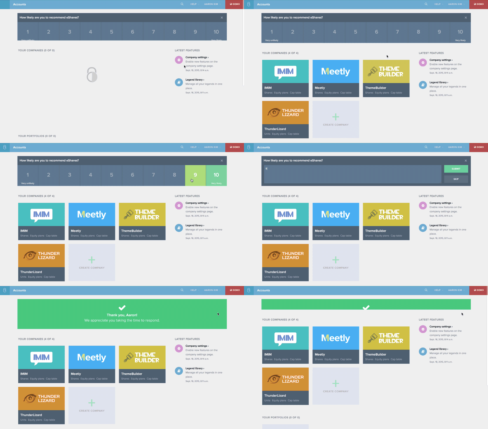
One of the best implementations of a feedback tool that I’ve seen is on eShares*, where the feedback widget is built in to the product, asks for one number and then optional text feedback. And they activate this periodically to get a sense of how things are going with new product features.

You may also follow me on @Twitter at @ManuKumar, and for all things @K9Ventures K9 Ventures is also on Facebook and Google+.
* CrowdFlower and eShares are K9 Ventures portfolio companies
